

What’s Wrong Here?
How To Correct Common Framing Issues
Do you ever wonder why some framed art is easy to look at, and some makes you want to move past it quickly? It could be the art itself – maybe you don’t care for the style or subject matter, like abstracts or landscapes – but maybe it’s because of the way it’s framed. Yes, the framing design makes a huge difference!
We’ve framed 4 pieces of art (each with 2 mats and 1 frame) in 2 different ways so you can see how the framing impacts the visual presentation.
Let’s take a look…
Family Photograph

There is no better reason for a family portrait than an addition to the family! Wouldn’t it be cute to use the baby’s outfit for the mat colors and a brown frame to match those darling curls?
Maybe, maybe not.

If it’s the baby you really want to see and not the frame design, make your eye go right to the focal point. This can be done by letting the bold color of the outfit stand out on its own instead of competing with the framing. In this case, a soft white doesn’t interfere with the blue outfit, taking your eye straight to the baby and the parents’ faces.
Serenity In the Guest Room

This serene, peaceful image is perfect for your guest room, which has green accents and oak furniture. The top mat should be green to match, right? And the frame should match the furniture?
Not necessarily.

Neutral colors sourced from the photograph (not your walls) will let the art shine, as well as blend with your current décor. By matting it a shade darker than the light on the water, we avoid competition with the focal point. The frame continues the soft, neutral vibe, making it easier and more peaceful to get lost in the serene view.
Abstract Art
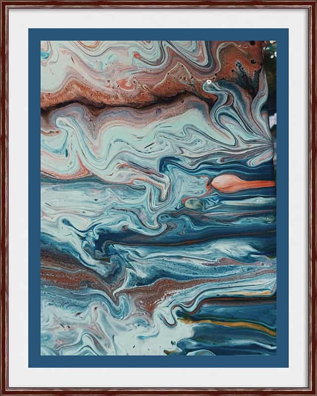
Abstract art is versatile and can frequently go with any décor because the design is usually non-specific. Abstracts can create a soothing feeling or add a splash of color to a space. Because abstract art sometimes has a lot going on, it’s best to give it space, or it can look confusing.
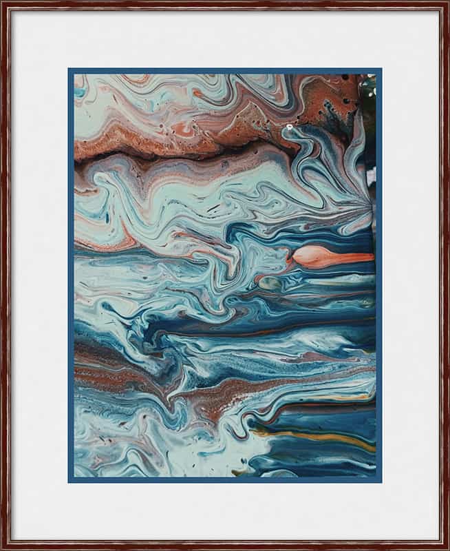
This colorful example was designed with the same 2 mats and frame, but with different matting proportions. The first appears cramped and overwhelmed, forcing your eye to the framing instead of the art. The second is easier on the eyes, with ‘breathing room’ for the art. Which would you rather look at?
Pink Flamingos
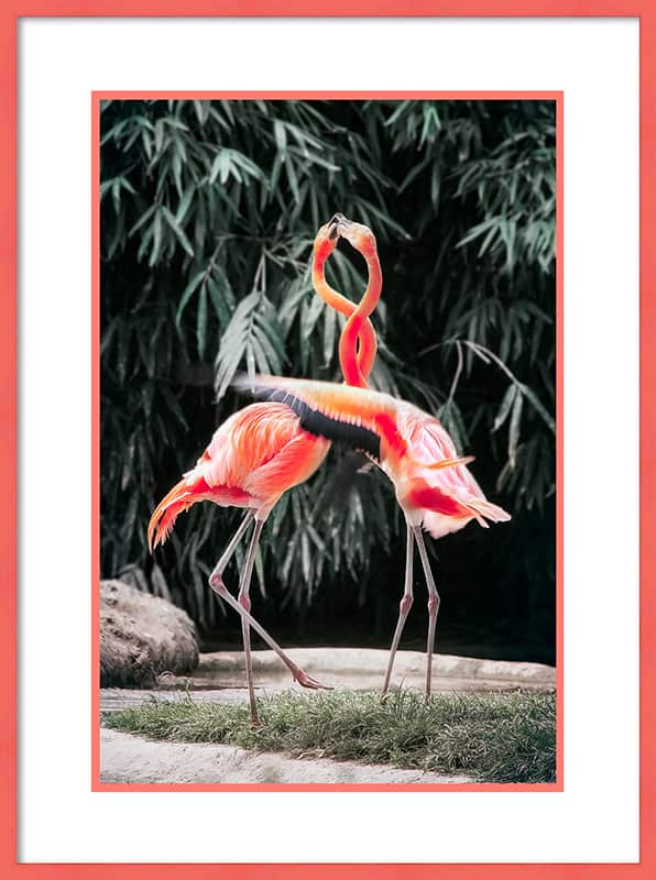
You could watch flamingos all day long, so you found art that lets you do just that. Of course, you want the flamingos to be what you see first when you look at it, so the best thing to do is neutralize it with a white mat, right? And the pink frame is a play on the flamingo color!
Great idea….or is it?
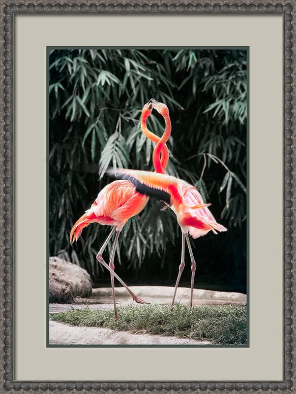
In this situation, the white mat contrasts with the pink, so pink is what you see – not the flamingo, just the frame. The white mat is stark – it creates a strong outline around a fairly dark image. Instead, pull the colors from the background, leaving the focal colors alone. Are the flamingos easier to look at now?
Rules of Thumb for Framing Design

- Stick to colors that are in the art
- The mat color should not be lighter or darker than any color in the art
- Contrast the top mat with the focal point
- Vary the widths of the design package components
See It Framed Before You Buy It!
We know how painful it can be to make a decision from a corner sample. But not anymore! We can show you what that corner sample will look like all around your art BEFORE you say yes. Stop in to see your design preview.