
Color Trends 2023
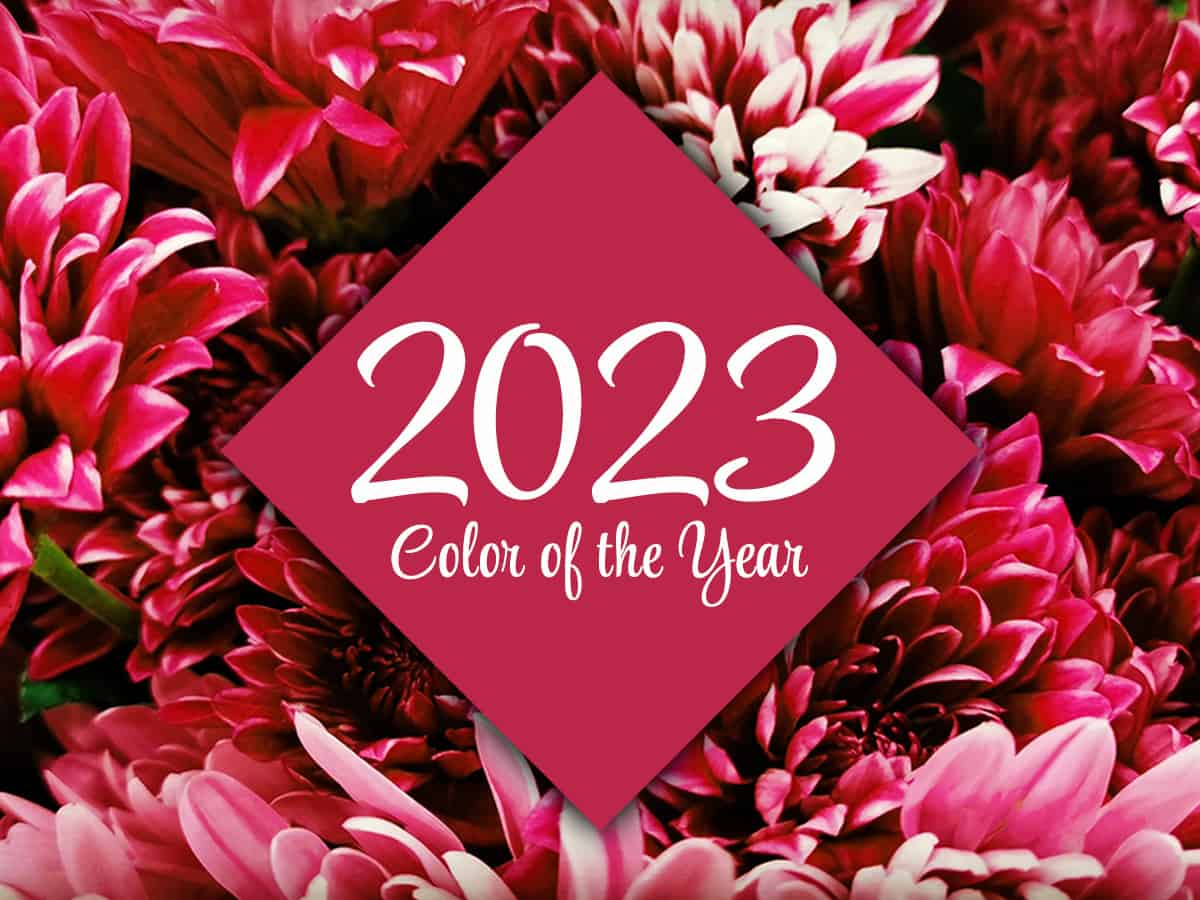
Viva Magenta is Pantone’s Color of the Year!
Viva Magenta! The top color forecasted for 2023 has verve, and that is exactly what we need right now. Pantone has declared the color to set a trend this year because it merges the warm strength of the natural world with the rich, open horizons of the digital world. Viva Magenta is brave and fearless, joyous and optimistic, powerful and empowering. It is assertive, but not aggressive; dynamic and bold, but fun; warm but also cool. The Red color family is an energetic group, encouraging experimentation and self-expression. Viva Magenta represents a positive future in an uncertain world. This color provides a psychological power and grace, giving us the verve we have been grasping for.

WORD OF THE DAY:
Verve: (noun)
enthusiasm or vigor; vivaciousness; liveliness; spirit
PANTONE 18-1750
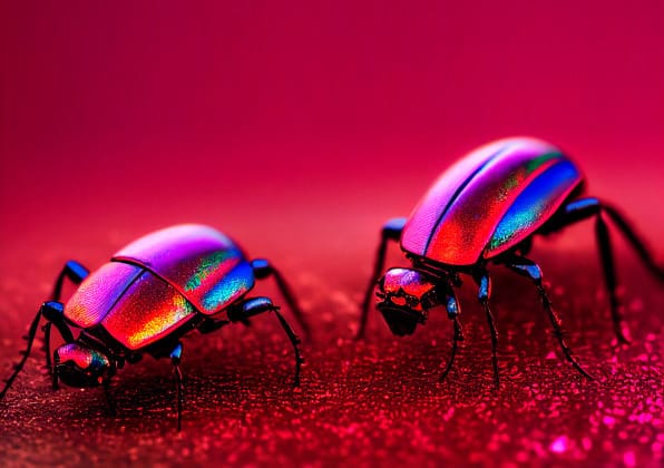
FUN FACT: The origins of the magenta shade can be traced back to the cochineal beetle, which produces red carmine dye, one of the most precious natural dyes.
Image credit: Huge / Pantone
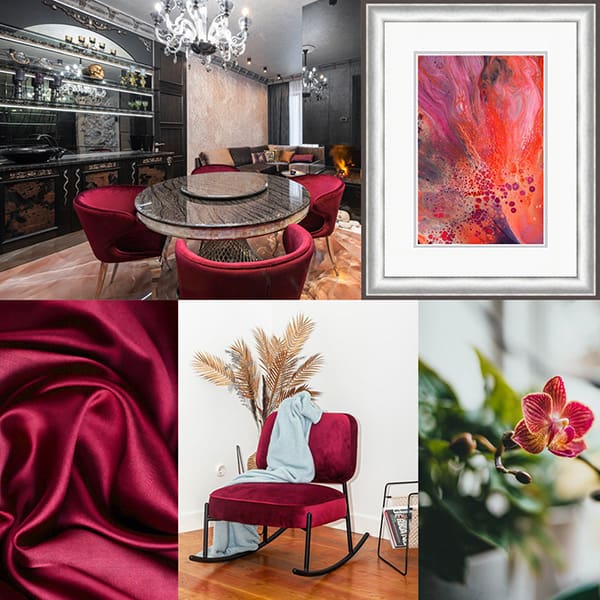
Using Viva Magenta in your Home
Many of us have neutral-colored walls and furniture. It is safe, but sometimes can be a bit boring. Make a stand-out statement with Viva Magenta! Neutral spaces often beg for a focal point – something as simple as changing out sofa pillows with magenta ones might do the trick. What about a fabulous piece of magenta colored art? Or a colorful chair? Or a floral arrangement? Or will you be daring and paint a single wall Viva Magenta for a dramatic look?
Last year greens were the IT color, and many of us embraced them; they were a soft, soothing shade. Red and Green are complementary colors, so try pairing Viva Magenta with Valspar’s color of the year, Green Trellis. The result will be a calm vibe, mixed with an energetic pop. Add polished silver hardware or frame and you’re set!

How are you going to use these colors this year?
We can help!
Color Trends through the Decades
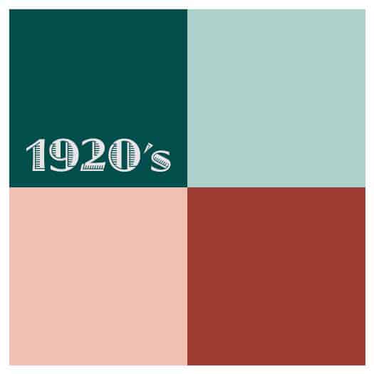
1920’s
The Roaring 20’s were a decade of indulgence. The walls were neutrals and accents were bright.
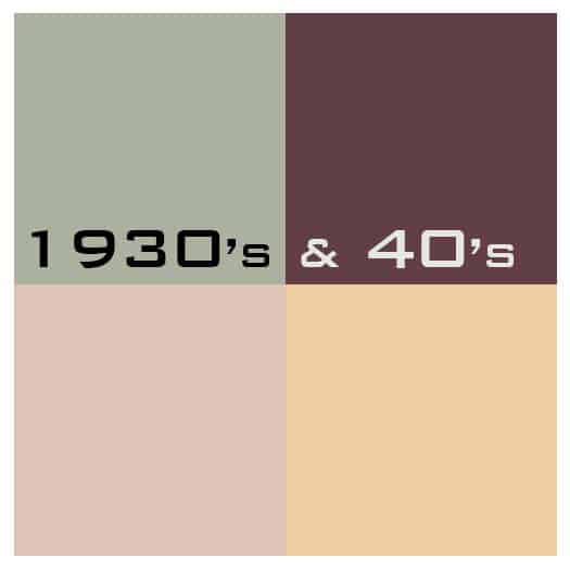
1930’s & 40’s
Smoky, dusty colors were the norm. Soft, subdued yellows, pinks, and hazy greens were accented with deep colors.
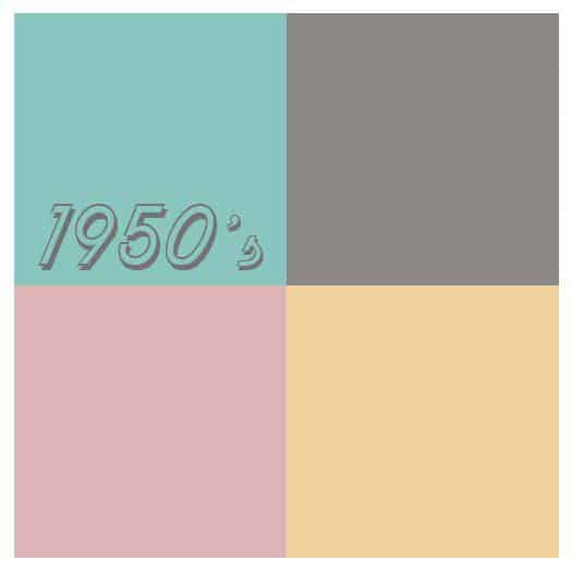
1950’s
Pastels ruled. They were even incorporated into appliances and bathroom fixtures.
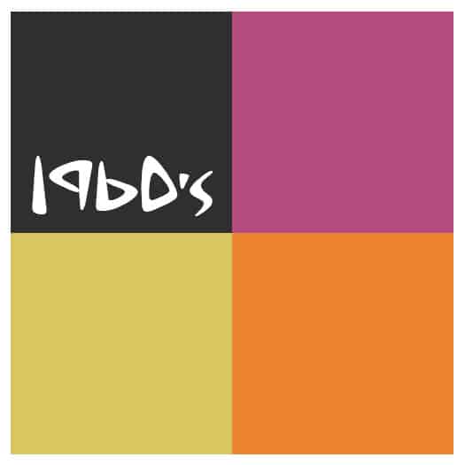
1960’s
The ‘Peace, Love & Rock n’ Roll’ decade brought bright, clashing colors. Black and white were used to neutralize them.
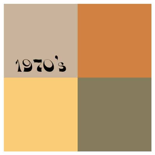
1970’s
Earthy colors dominate. Beige, rust, avocado, and harvest gold play together for a decade.
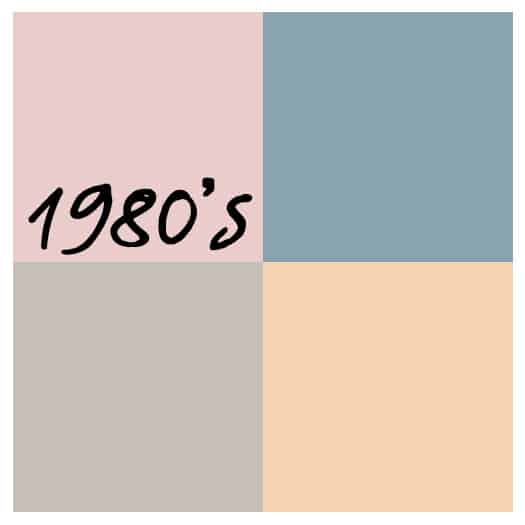
1980’s
Miami Vice and ‘country’ come together with mauves and blues. I bet you know a house that is decorated in those colors.

1990’s
A new take on earthy colors with a deeper, richer feel and Tuscan influences. Beige dominates, followed with terra cotta, sage and earthy reds.
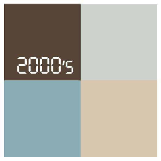
2000’s
Soft & Relaxing colors are popular to create a spa or coastal vacation feel in everyday life accentuated with pale blue and aqua paired with beige and white.
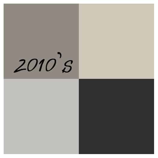
2010’s
Gray and any version of it is king! With the tech generation in full swing, gray was everywhere; paint, furniture, flooring, appliances, fixtures and, of course, laptops.