
Why Did We Choose These Frames?
Finding The Frame You’ll Love Forever
We know it can be a bit overwhelming when you walk into our shop and see a wall filled with hundreds of frame corner samples. Our designers are here to help de-mystify the design process, and show you some guidelines that will place the perfect frame on your art.
GO WITH THE FLOW
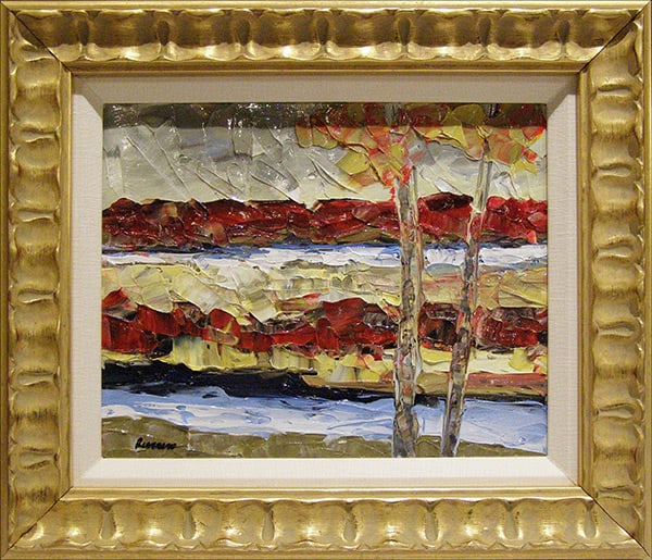
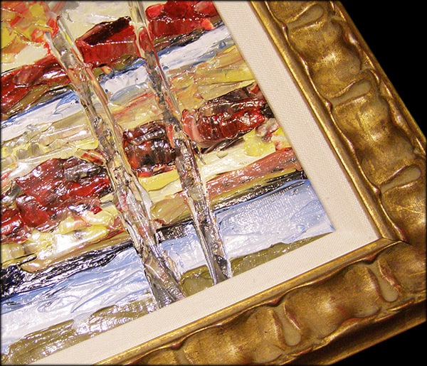
A modern take on a traditional frame color choice! There are a lot of gold accents in this abstract landscape painting, and the gold frame complements them without taking away from the focal point. The textural paint is matched in the wavy frame pattern.
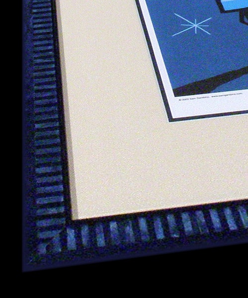
HAVE FUN WITH IT
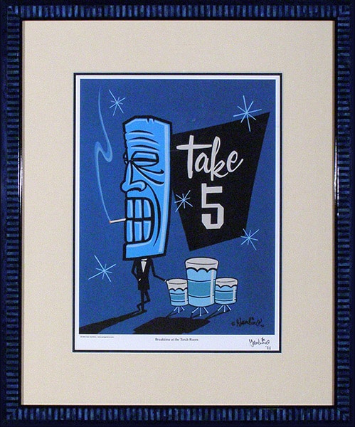
You can’t deny how fun this art is! It needs a frame that can give it a musical vibe, one with movement. Our frame design has a rhythmic element reminiscent of a drumbeat or piano keys. The blue tone of both artwork and frame encourages the viewer to relax and feel the chill energy.
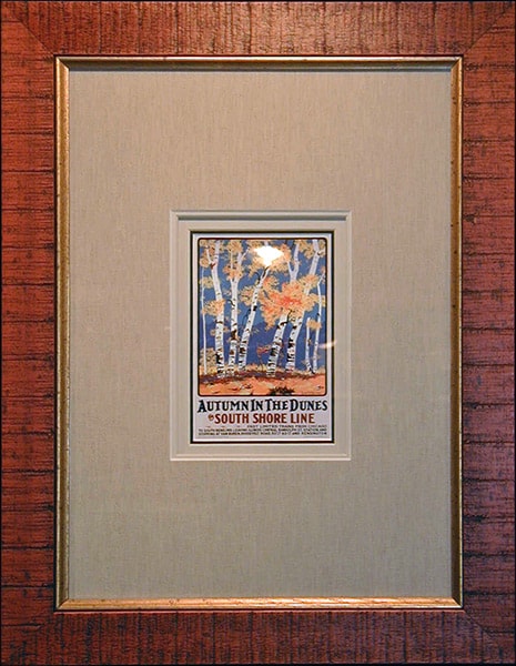
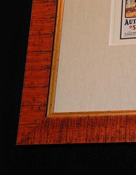
SIMILAR BUT DIFFERENT
This rustic birch tree image is framed in a wood moulding that mimics the texture of the trees. A white frame could have been chosen because birch trees have white bark; instead, the colorful frame creates a warm feeling due to the rust-colored accents in the art.
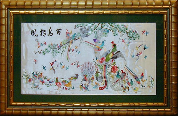
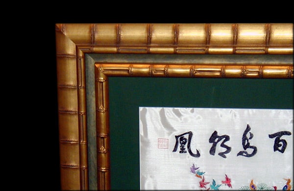
EMBRACE THE CULTURE
Sometimes it is best to honor the feel of the region/country where the art came from. This hand-embroidered silk art from Asia looks natural in a bamboo frame. Texture and tone complement the stitching while not overpowering this gentle piece.
Do you have artwork that you’d like to frame, but are unsure of what kind of frame to choose? We can help!
Please note: pictured frames are subject to availability. These examples serve as a visual on how to think of frames working with art.