Explain This Frame, Please
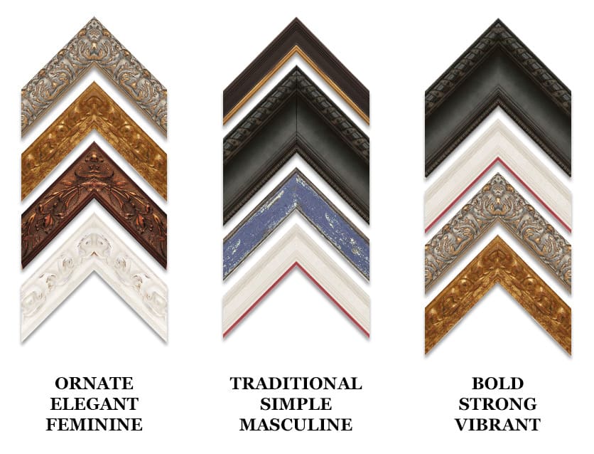
There is no such thing as ONE perfect frame design…
Do you think there is only ONE perfect frame for a piece of art? The answer is NO! There can be many ‘perfect’ frames for a piece of art. That’s probably why it seems so challenging to narrow down the options. What’s important is choosing the right frame for YOU. Let’s break it down and show you how different frames can work with the same piece of art and why.
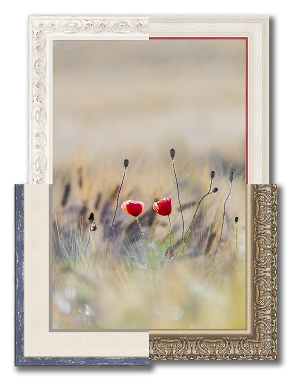
Blooming Blossoms
About the Art:
Blooming Blossoms is a highly stylized photo of red poppy flowers blooming in a blurred grass field. This piece is a soft, neutrally toned art with a bright focal point. It would complement any area that calls for serenity. When choosing a frame be careful not to overpower the focal point.
About the Frames:
- White (upper left): It’s hard not to notice the red flowers in the center, but by using a frame that extends the background, it highlights the flowers even more. Choosing a frame that has a flowing rounded design mimics the soft curves and lends a feminine touch.
- White & Red (upper right): Adding a hint of red is going to draw the eye to the red poppies, and emphasize that the flowers are the focal point. Paired with a clean white frame that extends the background, it gives the piece a subtle simplicity with pop.
- Blue & White (lower left): When you first looked at this piece, did you notice the soft grey-blues in the background? Now you do. It draws out other colors without taking away from the focal point.
- Silver & Gold (lower right): Many people shy away from ornate frames because they might make the art feel too fancy or strict. In this case, the warm gold/silver color combo and the soft, curved carving flows with the art and gives it formality without stuffiness.
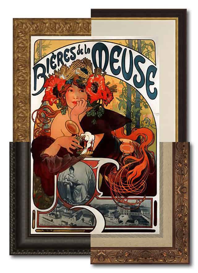
Bieres de le Meuse
About the Art:
Alphonse Mucha, 1897. Bieres de le Meuse (‘Beer of the Meuse’) was a French advertisement typical of the Art Nouveau period. Art Nouveau is known for its elaborate use of color, flourishes, and graphic design style. It can pair well with ornate frames or frames with clean, elegant lines.
About the Frames:
- Gold (upper left): There are many gold tones in this piece, so you can’t go wrong with surrounding it in more of the same color. The frame’s soft, curvy design flows seamlessly with the art, which turns an ornate frame style into something whimsical.
- Black (upper right): A black frame is like black clothing – it goes with everything – but you have to be careful how you use it. For this piece, choose a smaller frame profile with a touch of gold. Adding a mat allows your eye to easily rest on the art without the black frame dominating. This has a traditional and universal feel so it will match any decor.
- Espresso (lower left): There is so much going on with this art, that a wide, soft dark brown frame helps calm it down. Notice the detail carved into the outer edge of the frame? That helps tie the design in the art to the frame. This is a transitional look that works well in an eclectic space.
- Copper (lower right): This frame has a coppery-gold finish but is carved in an Art Nouveau pattern. It speaks directly to the period in which the art was created. Matting creates a buffer between the art and the frame allowing each one to shine.
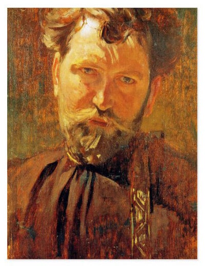
Artist Profile: Alphonse Mucha
Alphonse Mucha (pronounced ‘moo-ka’), was born in what is now the Czech Republic on July 24, 1860 and died there on July 14, 1939. He moved to Paris in 1887. Mucha painted in a style called Art Nouveau (French for ‘New Art’). Many of Mucha’s works reflect the flavor of modern life in the latter part of 19th century Paris and the blossoming use of print advertising. Many of Mucha’s advertising pieces featured a single figure or a woman against a halo-like disk, arranged harmoniously with flowers and other decorative motifs. The idea was to draw potential consumers’ attention to a feminine beauty and then send an alluring message about the product being represented. Mucha not only painted, but he designed jewelry, carpets, wallpaper and theatre sets.
What do these frames have in common?